Frequency and Cumulative Frequency
In the first video, we are going to use frequency and cumulative frequency. After you finish this lesson, view all of our Algebra 1 lessons and practice problems.
For example:
List: 3, 3, 3, 9, 12, 14, 14, 15, 19, 29, 34, 34, 35, 36, 37
Let’s make a table to group the numbers. Make sure that the intervals are the same for all groups.
Frequency
| Range | Tally | Frequency |
 |
||| | 3 |
 |
| | 1 |
 |
|||| | 4 |
 |
| | 1 |
 |
0 | 0 |
 |
| | 1 |
 |
||| | 3 |
 |
|| | 2 |
Cumulative frequency starts from the first value, and the initial value remains when moving on to the next group.
For example:
| Range | Tally | Frequency |
|
||| | 3 |
 |
|||| | 4 |
 |
8 | |
 |
9 | |
 |
9 | |
 |
10 | |
 |
13 | |
 |
15 |
Examples of Frequency, Cumulative Frequency, & Histograms
Example 1
List: 15, 18, 19, 20, 20, 22, 22, 22, 24, 25, 26, 27, 28, 28, 34, 34, 35, 38, 39, 40, 40, 45
Frequency
Cumulative Frequency
Example 2
List: 1, 1, 1, 3, 4, 4, 5, 6, 6, 8, 8, 8, 8, 9, 9, 9, 10, 11, 12, 12, 15, 15, 18, 18, 18, 19, 20, 22, 22, 25, 25, 25, 28, 29, 29
Frequency
Cumulative Frequency
Video-Lesson Transcript
Let’s go over frequency and cumulative frequency.
Let’s start with this:

Let’s draw a table and label them with range, tally, and frequency.
Ranges are:


A couple of things to note:
1. Because I’m using less than or equal to sign, I can’t repeat values here. The next range should be bigger than the previous range.
2. Size of each range is exactly the same.
Now, we’re ready to tally the numbers using the ranges.
has  has
has  has
has  has has
  has has has
Then let’s write the actual frequency.
has is  has is
  has is
  has is has is has is has is has is
So, this is our frequency chart.
Same thing with a cumulative chart.
Let’s label the table with range, tally, and cumulative frequency.
Ranges are:


Instead of starting with the highest number for the next range, we’re still going to start with for all the ranges.
Now, let’s tally.
has has has |||| |||
has |||| ||||
has |||| ||||
has |||| ||||
has |||| |||| |||
has Now, let’s write the cumulative frequency.
has is has is has  has
has  has has
  has
has  has
has 
You should notice that as you move down the table, cumulative frequency increases or remains the same. But definitely does not go down.
Each next row can have the previous number or increase it. But definitely not be less than the previous range.
Now, let’s take a look at this.
We can actually get the cumulative frequency by using the first table.
Let’s make sense of this.
From to  , we included three in the group.
Then in to , we expanded and included one more. So from to .
Then in to , we already have and included four more numbers. The cumulative frequency increased by . So now, we have .
Then when we move up to  , we added one more.
When we move up to  , none added. So, we stayed at .
Up to  , we included one more. So the group became .
When we move to  , we added three more. So our cumulative frequency is .
Lastly, moving up to  , we included two more numbers. Now, we have .
Let’s see how we get that from this table.
We just have to add the next frequency to the previous, we’ll get the cumulative frequency.
Representing Frequency and Cumulative Frequency with a Histogram
In the second video, we are going to create a histogram.
Examples of Representing Frequency and Cumulative Frequency with a Histogram
Example 1
Representing Frequency with Histogram
Example 2
Representing Cumulative Frequency with Histogram
Histogram:
Let’s use the same list from the first video. Histograms look relatively close to bar graphs with minor changes, but the overall ideas are the same. Mark the x-axis with the desired intervals and the y-axis with the values. Make sure that the values are increasing at a constant rate.
For the cumulative frequency, each interval of the histogram is going to be the sum from the first interval to the current interval as shown below:
Video-Lesson Transcript
Let’s go over histograms frequency and cumulative frequency.
For example:
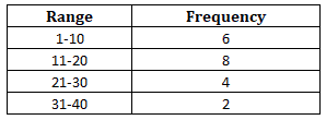
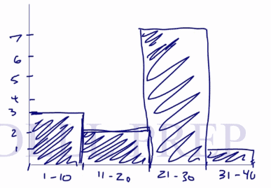
Range is  the frequency is .
In range  the frequency is .
In range  the frequency is
  .
.
In range  the frequency is .
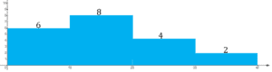
Now, let’s graph this.
The  -axis represents the range while the
  -axis represents the frequency.
Then let’s draw a bar.
This looks like a bar graph but the most important thing is that they are touching each other.
There are no spaces in between. Unless the frequency of a range is zero.
Now, let’s graph the cumulative frequency using the same information as above.
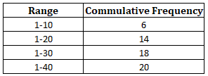
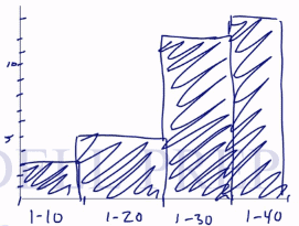
Range is the frequency is .
In range  , we included two more so the frequency is .
We’ll jump to , we’ll pick up seven more values. So, the frequency is  .
.
Then we’ll jump up to , we have to add one more. With a total frequency of .
Now, we’re ready to graph.
We’ll just change the values on the -axis to match our frequency.
The intervals stay the same.
Once you draw a bar graph, shade it in.
Cumulative frequency increases so the bar increases also.
Or they can be of the same height. But never decrease.
Using this histogram, we can see the group in the range .
Range  is .
is .
Range  is .
is .
So, what’s the difference?
One. That’s the frequency in .
Likewise, we want to see how many are in the interval from .
Let’s look at how many are there up to inclusive there are . But up to , we only have .
So how many were added when we included up to ?
Seven. So from , there are in the group.
In the frequency table, we also have .
To find , has values and has values. So, there’s in .
Which is the same as the table.