An example of a rate is 25 miles/hr, which means the object will move 25 miles for every hour that passes.
An example of a ratio is 2 eggs:3 ounces of flour, which means the recipe calls for 2 eggs for every 3 ounces of flour used.
A statement that 2 rates or ratios are equal is a proportion.
For example, this is a proportion:

We can check if the proportion is correct by cross-multiplying
If we cross multiply, we get
(12)=(8)(3)")
which simplifies to

This proves that the proportion is correct.
When setting up a proportion, always write down how you will set it up.
For example, if we know that someone reads 13 pages every 4 minutes, we can find out how many pages he would read in 22 minutes.
Write down how it would be set up first.
Then insert the values.

Use cross-multiplication to solve
becomes
(22)=(x)(4)")
Simplify to get

Divide both sides by 4 to get

That means based on the rate, the person would read 71.5 pages in 22 minutes.
A common type of proportion question on the SAT is a word problem in which a ratio is given. However, instead of giving you a value of one of the elements in the ratio, the question gives you the total of the elements in the ratio.
To solve for values when a ratio and a total is given, multiple each number in the ratio by x and then create an equation in which they all add up to the total. Then solve for x, and use that value of x to determine the other values.
Example
The ratio of boys to girls in a class is 2:3. If there are 45 students, how many boys are there?
Explanation & Solution
We know that the ratio of boys to girls is  . That means the numbers could be 2 & 3, 4 & 6, 6 & 9. 8 & 12, etc.
What’s important is that whatever we multiply 2 by (for boys) we have to multiply 3 by (for girls). We can represent the number of boys as  and the number of girls as
  .
.
We know that
(# of boys) + (# of girls) = (total # of students)
We can write the equation as

Combine like terms to get

divide both sides by 5

This is not the answer. The question asks for the number of boys.
Number of boys is , so  =18") .
.
A way the SAT tests your knowledge of proportions is to mix up units on proportion questions.
Make sure to correct the units if they are different, before setting up the proportion.
Example
Tammy can read pages in minutes. How many pages can she read in hours?
Explanation & Solution
Let’s set up the proportion as 
Now, let’s set it up.
If we write

This would be incorrect because in the denominator on the left the 4 is in minutes and in the denominator on the right the 2 is in hours. The units don’t match up.
Let’s rewrite the 2 hours as 120 minutes, so both sides are using minutes.

Now, we can cross-multiply
(120)=(x)(4)")
Simplify

Divide both sides by 4

On the SAT, you may be asked to compare the results of a formula when certain values are changed to an original value in the form of a ratio.
When given a formula, we can determine how one value will be affected by altering other values.
For example,
The weight of an object,  , is found by multiplying the mass of an object,
  , by gravity,
  .
.
If the mass,, is doubled, the weight, , will be doubled.
Just like when we solve equations, whatever we do to one side of the equation, we have to do to the other side of the equation.
Similar figures and shapes have proportionate side lengths.
A useful way to write down how we are setting up a proportion regarding geometric shapes is:

When dealing with proportionate shapes, make sure that you’re dealing with corresponding lengths. It is common for a question to ask for the length of a segment and not a full side.
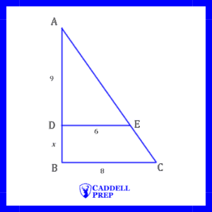
Example
What is the value of  in the figure below?
Explantation & Solution
Let’s set up the proportion as
,
is not a length of the small or large triangle. 9 is the height of the small triangle. Let’s use  to represent the height of the large triangle. After we solve for , we’ll be able to find the value of .
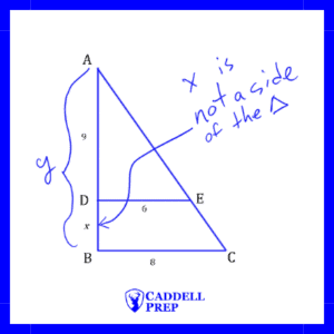
Now, we cans set up the proportion as
,
 ,
,
cross-multiply to get
 ,
,
divide both sides by 6

Remember than the question is asking for . is the total length.
To find we have to subtract 9 from .
 ,
,

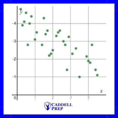 Negative correlation |
 Strong negative correlation |
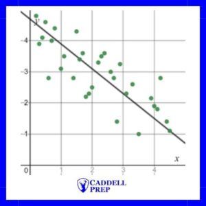
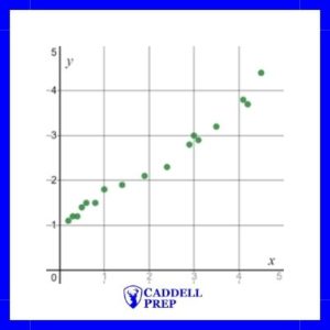
The line of best fit is modeled by =-\dfrac{4}{5}x+4.7") .
.
Obviously, each point on the scatterplot is not on the line of best fit. However, it does show the trend of the data and can be used to make estimations.
Based on the line of best fit, we can estimate the -value when is 4 by substituting into the function .
 ,
,
+4.7") ,
,

If we look at the graph, we can see that when x is 4, y is approximately 1.9, not 1.6. It’s important to remember that we use the line of best, or a trendline, to estimate values.

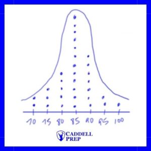
For example, let’s find the mean of: 80, 90, 90, 95, 95

Many times, on the SAT it is important to be able to find the sum of the items in order to solve the problem.
Sum of Items=(Average)*(Number of Items)
Example
Mike’s average for 5 math tests is 90. His teacher is going to drop his lowest test, a 70. What will his average be for the remaining four tests?
Explanation & Solution
It is important to realize that we do not need to know what the other four test grades are. We only need to know what they add up to.
First let’s find his total including all 5 tests
Sum of Items=(Average)*(Number of Items)
\times(5)")

Now to find his new total, after dropping the 70, we simply have to subtract 70.


To find his new average we use the Arithmetic Mean (average) formula
Mean= (Sum of Items)/(Number of Items)


Median: The middle number in a set of numbers when arranged in order numerically.
Mode: The number that appears most often. It is possibly to have more than one mode.
Range: The difference between the largest number and the smallest number.
Example
Mary had the following bowling scores: 125, 215, 136, 195, and 202. How much greater is the median score than the mean?
Explanation & Solution
To find the median, put the scores in order and find the middle term.
In order, the scores are:
125, 136, 195, 202, 215
The median is 195.
Now let’s find the mean.


Now, we have to find the difference.
 =20.4
=20.4
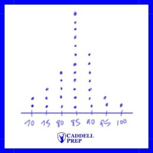
Let’s look at the table of data provided.
| Tests Scores | # of students |
|---|---|
| 100 | 1 |
| 90 | 3 |
| 80 | 5 |
| 70 | 0 |
| 60 | 1 |
| 50 | 0 |
To find the mean from a table, total all of the rows and then divide by the total frequency of values.
We can find the total of the values by multiplying each value by the frequency then adding.
In the table above, there is one 100, three 90s, five 80s, etc. Instead of adding them individually, we can find the total of each row.
 ,
,
 ,
,
 ,
,
 ,
,
 ,
,
 ,
,
If we add all oof those up, we get 830.
If we add up the frequency column (# of students) we get 10.
Finally, we can find the mean (average).
 ,
,

To find the median, we don’t want to write out all of the values.
Instead, we want to determine which term will be the middle term from the table.
To find which term will be the median, use the following formula

Where  is the number of terms. Note: If there is an even number of terms, we will get an answer that ends in “.5”. This means the median is the average of the numbers in the places before and after.
Example
If there are 13 numbers, which one will be the median?
Explanation & Solution
Let’s use the formula
,
 ,
,
 ,
,
 ,
,
The median is the 7th term.
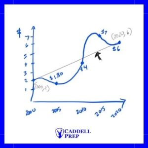
Rate of change = slope
 ,
,
 ,
,

The average increase is $0.20/year.
Example
Year | Average Home Price ($) |
1970 | 180,000 |
1980 | 195,000 |
1990 | 220,000 |
2000 | 250,000 |
2010 | 205,000 |
2020 | 230,000 |
The table above shows the average home prices in Makebelieveville. What is the average annual increase in average home prices from 1980 to 2010?
Explanation a& Solution
In 1980, the average was $195,000.
In 2010, the average was $204,000.
Since we are looking for the average annual increase, we need to find the change in price per year.
Rate of change = slope
,
 ,
,
 ,
,

Annual increase of $333.33