Give us a call (917) 722-0677

You can excel with Caddell!

By Glyn Caddell, BSME · Author of Digital SAT Math Secrets · Tutoring since 2008 — Updated August 18, 2026

Digital SAT Data & Probability

Data & probability questions test students’ ability to interpret data from a chart and/or perform calculations related to the probability of an event occurring. Some questions will ask to find the likelihood of an event occurring, while others may ask for the total possible outcomes, such as the number of different ordered groups. Data & probability questions appear on approximately 8.7% of the Digital SAT. Data & probability questions fall under Problem-Solving and Data Analysis according to the College Board.

Data & Probability Lesson

The lesson covers the types of data & probability questions that show up on the Digital SAT, including surveys and bias; scatterplots & correlation; mean, median, mode, and range; tables; probability; standard deviation; and average rate of change. 

What Do Data & Probability Questions Look Like?

Here are some examples of Data & Probability questions from the Digital SAT.

  • What is the probability of…
  • Which statement correctly compares the mean of data set X and the mean of data set Y?
  • Based on this survey, which of the following is the best estimate of…
  • What is the median of the data shown?
  • What is the mean of the data set?
  • Based on the bar graph, how many students chose activity 3?
  • Based on the line graph, in which year was…
  • Which of the following correctly compares the medians and the ranges of data sets A and B?
  • What is the range of the 7 scores shown?

1. Surveys and Bias

It is common to see a question on the SAT that asks why a survey conducted is unreliable. Most of the time it is unreliable because of a possible bias related to who was surveyed, where they were surveyed, when they were surveyed, or how they were surveyed.

When choosing the group of people to be surveyed, the group should be a random sample of the entire population to be surveyed. For example, a survey to determine a town’s favorite pizzeria should randomly survey people from the town.

Most of the times, the answer won’t be because of the sample size.

Here are some examples of creating a bias based on who was surveyed:

  1. A survey of the favorite class of students at a high school would not be reliable if only students from the freshmen class were surveyed or if any of the grades were excluded from the survey.
  2. A survey of car enthusiasts to find out which car is the most popular would not be reliable if the survey was sent to a mailing list of people who owned a certain type of sports car.

Here are some examples of creating a bias based on the location of the survey:

  1. A survey of adults to determine the average number of children per household would not be reliable if the survey was done at a location where there are likely children because most of the adults there will have children. For example, at a playground the adults there are likely there with children, so it is less likely to survey an adult with no children.
  2. A survey of people’s favorite activity would not be reliable if it was held at a place related to one of those activities. For example, at a movie theater the people are likely to choose going to the movies or at a bookstore the people are more likely to choose something related to reading.
  3. A survey of whether people prefer watching sports in person or at home would not have reliable results if the survey was done outside a stadium before a game. The people there may be going to the game to watch it in person. Plus, it excludes the people who are home and waiting for the game to start.

Here are some examples of creating a bias based on when they were surveyed:

  1. A survey of the most popular occupation in a town would not be reliable if people were randomly surveyed inside a supermarket on a weekday during the workday because people with professions that require them to work during normal work hours would be excluded from the survey.
  2. A survey done to determine the opinion of the population of a town will likely not be reliable if done at a time when the majority of the population is expected to be sleeping.

An example of how a bias could be created is:       

A survey that requires people to use a specific type of phone or through a specific social media application because it will exclude people who don’t have the specific type of phone or the specific application.

However, if the purpose is to survey owners of a specific phone, then it should be required that they use that type of phone to participate.

2. Scatterplots, Correlation, & Trendlines

Scatterplots

Scatterplots are plots of data points (x, y). Common scatterplots are graphed against time, such as price vs. time, population vs. time, height vs. time, etc. In these cases, time is measured along the x-axis, and the other data along the y-axis. However, any comparison of data can be plotted; it doesn’t have to be against time.

On the SAT, questions involving scatterplots tend to include topics such as correlation, trendlines, and predicting data.

Correlation

When a relationship appears to exist among data points it is said that there is correlation.

For example, as time increases, the cost of college increases. Since they both go up, it is said that there is positive correlation.

Below is an example of a positive correlation between x and y.
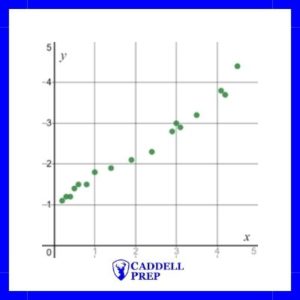
example of positive correlation

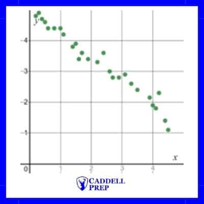
Another example would be as time increases the population of a specific species decreases. Since one value increases while the other decreases, it is said that there is a negative correlation.

Below is an example of a negative correlation between x and y.
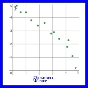
example of negative correlation

The more apparent that there is a relationship, the stronger the correlation is said to be.

Below are two examples of a negative correlation between x and y. However, the graph on the right shows a stronger correlation than the graph on the left.
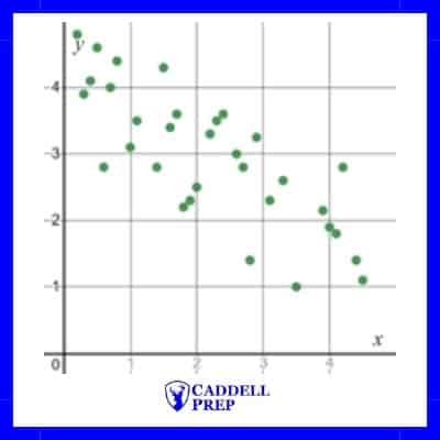
Example of negative correlation
Negative correlation
example of strong negative correlation
Strong negative correlation

Trendlines

Trendlines (lines of best fit) can be applied to scatterplots that show correlation.

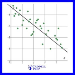
For example, a trendline has been added to the scatterplot below.

line of best fit for scatterplot example

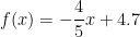
The line of best fit is modeled by f(x)=-\dfrac{4}{5}x+4.7.

Obviously, each point on the scatterplot is not on the line of best fit. However, it does show the trend of the data and can be used to make estimations.

Based on the line of best fit, we can estimate the y-value when x is 4 by substituting  into the function f(x)=-\dfrac{4}{5}x+4.7 .

y=-\dfrac{4}{5}x+4.7,

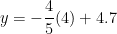
y=-\dfrac{4}{5}(4)+4.7,

y=1.6

If we look at the graph, we can see that when x is 4, y is approximately 1.9, not 1.6. It’s important to remember that we use the line of best fit, or a trendline, to estimate values.

3. Mean, Median, Mode, and Range

Mean (Average)

  • Mean= \dfrac{Sum of Items}{Number of Items}

    For example, let’s find the mean of: 80, 90, 90, 95, 95

    Mean= \dfrac{80+90+90+95+95}{5}=90

    Many times, on the SAT it is important to be able to find the sum of the items in order to solve the problem.

    Sum of Items=(Average)*(Number of Items)

    Example

    Mike’s average for 5 math tests is 90. His teacher is going to drop his lowest test, a 70. What will his average be for the remaining four tests?

    Explanation & Solution

    It is important to realize that we do not need to know what the other four test grades are. We only need to know what they add up to.

    First let’s find his total including all 5 tests

    Sum of Items=(Average)*(Number of Items)

    Sum=(90)\times(5)Sum=450

    Now to find his new total, after dropping the 70, we simply have to subtract 70.

    New Sum=450-70New Sum=380

    To find his new average we use the Arithmetic Mean (average) formula

    Mean= (Sum of Items)/(Number of Items)

    Mean= \dfrac{380}{4}Mean= 95

Median, Mode, & Range​

Median: The middle number in a set of numbers when arranged in order numerically.

Mode: The number that appears most often. It is possible to have more than one mode.

Range: The difference between the largest number and the smallest number.

Example

Mary had the following bowling scores: 125, 215, 136, 195, and 202. How much greater is the median score than the mean?

Explanation & Solution

To find the median, put the scores in order and find the middle term.

In order, the scores are:

125, 136, 195, 202, 215

The median is 195.

Now let’s find the mean.

Mean = \dfrac{125+136+195+202+215}{5}Mean =\dfrac{873}{5}Mean=174.6

Now, we have to find the difference.

195-174.6 =20.4

Mean, Median, Mode, & Range from a Frequency Table

Sometimes on the SAT, data will be presented in a table. This makes the question slightly more difficult, partially because a table can include much more data than a list. Another reason it is complicated is students overlook the frequency of each value. Here are the methods for solving mean, median, mode and range questions on the SAT when the data is provided in a table.

Mean (Average) From a Frequency Table

Let’s look at the table of data provided.

Tests Scores# of students
1001
903
805
700
601
500

To find the mean from a table, total all of the rows and then divide by the total frequency of values.

We can find the total of the values by multiplying each value by the frequency then adding.

In the table above, there is one 100, three 90s, five 80s, etc. Instead of adding them individually, we can find the total of each row.

100\times 1 =100,

90 \times 3 =270,

80 \times 5=400,

70 \times 0=0,

60\times 1=60,

50 \times 0=0,

If we add all oof those up, we get 830.

If we add up the frequency column (# of students) we get 10.

Finally, we can find the mean (average).

Mean=\dfrac{830}{10},

Mean=83
Median from a Frequency Table

To find the median, we don’t want to write out all of the values.

Instead, we want to determine which term will be the middle term from the table.

To find which term will be the median, use the following formula

Median Term=\dfrac{n+1}{2}

Where n is the number of terms. Note: If there is an even number of terms, we will get an answer that ends in “.5”. This means the median is the average of the numbers in the places before and after.

Example
If there are 13 numbers, which one will be the median?

Explanation & Solution

Let’s use the formula
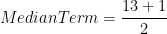
Median Term=\dfrac{n+1}{2},

Median Term=\dfrac{13+1}{2},

Median Term=\dfrac{14}{2},

Median Term=7,

The median is the 7th term.

Mode from a Frequency Table

Let’s look at an example of finding the mode from a table of data.

Tests Scores# of students
1001
903
805
700
601
500

Mode is the easiest to find from a table, but still trips up some students.

The value with the greatest frequency is the mode, so in this case 80 is the mode because 5 students scored an 80 (the frequency is 5).

Some student might get tripped up and pick 0 or 1 because they appear the most, twice.

However, we have to realize that the second column represents frequencies.

Really, this is the data in the table:

100, 90, 90, 90, 80, 80, 80, 80, 80, 60

Now, it is clearer that the mode is 80.

Range from a Frequency Table

Below is a table of data that shows the frequency of test scores for a class.

Test Scores# of students
1001
903
805
700
601
500

Finding the range from a table is fairly straight forward, simply find the difference between the highest value and the lowest.

Be certain to subtract values and not frequencies.

Also, make sure the value exists in the data set. For example, if we look at the table above, it looks like 50 is the lowest value, so the range would be 100-50=50.

However, there are no 50s (the frequency is 0), so the lowest test score is actually 60.

The range is 100-60=40.

4. Filling in Data Tables

Sometimes data will be presented in a table. In those tables one column and/or one row may represent totals.

The values should add up correctly and give the right totals.

For example, let’s look at the following table


Saw the Movie

Didn’t See the Movie

Total

Men

58

192

250

Women

238

12

250

Total

296

204

500

The columns add up.

The column “Saw the Movie” adds up, 58+238=296

The column “Didn’t see the Movie” adds up, 192+12=204

The last column “Total” adds up, 250+250=500

The rows also add up.

The row for “Men” adds up, 58+192=250.

The row for “Women” adds up, 238+12=250.

The row for “Total” adds up, 296+204=500.

Since we can add up the values, we can solve for missing values.

5. Probability

Probability is the likelihood of something occurring.

For example, if you roll a die, there is a 1/6 chance of it landing on 3.

Probability=(# of favorable outcomes)/(total possible outcomes)

For rolling a 3, there is only one 3 on a die, so the number of favorable outcomes is 1. There are 6 possible outcomes, so the number of total possible outcomes is 6. Therefore, the probability is 1/6.

Probability can be expressed as a fraction, a decimal or a percent.

1/6=0.167=16.7%

Example

Television Programs Watched Each Week


None

1 to 3

4 or more

Total

Group A

5

38

57

100

Group B

7

45

48

100

Total

12

83

105

200

For a science project, a student interviewed 200 people. Group A consisted of 100 adults and Group B consisted of 100 high school students.

Part 1

If a person is chosen at random from Group A, what is the probability that the person watches 4 or more television programs each week?

Part 2

If a person is chosen at random from those who watch at least 1 television program per week, what is the probability that the person belonged to Group B?

Part 3

If a person who participated in the science project is chosen at random, what is the probability that the person was from Group A and watched 1 to 3 television programs per week?

Explanation & Solution

Part 1

A person is chosen at random from Group A, so a person will be chosen out of 100 people. This will be the denominator.

In Group A, there are 57 people who watch 4 programs or more, so there are 57 favorable outcomes.

The probability of selecting a person that watches 4 or more television programs from Group A is 57/100 or 0.57.

Part 2

A person is chosen at random from those who watch at least 1 television program per week. At least one television program per week includes the people who watch 1-3 programs per week and 4 or more programs per week.

We have to add the 83 people who watch 1-3 programs per week and the 105 people who watch 4 or more programs per week to get a total of 188 people that we are selecting from. 188 will be the denominator.

We need to find the probability of selecting someone from Group B out of the 188 people, so we need to find the number of people in Group B who watch at least 1 television program per week. In Group B, 45 people watch 1-3 television programs per week and 48 watch 4 or more television programs per week, so there are 93 people in Group B who watch at least 1 television program per week.

The probability of selecting a person from Group B from the people who watch at least 1 television program per week is 93/188 or as a decimal it could be written as .494 or .495.

Part 3

For Part 3 of this SAT example, a person is chosen randomly from the project, so a person is chosen at random from all 200 participants. The denominator will be 200.

The question is asking for the probability of selecting someone from Group A who watches 1-3 television programs per week. There are 38 people in Group A who watch television 1-3 television programs per week, so the probability is 38/200, which reduces to 19/100 or .19.

6. Standard Deviation

In many cases, large data sets tend to have values that are centrally located.

For example, the test grades of a class might be as follows:

Test Grade

Frequency

70

2

75

3

80

5

85

12

90

7

95

2

100

1

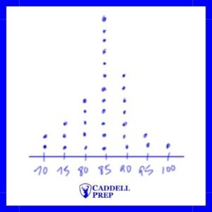
The average test grade in the class is 84.5. From the table, we can see that most of the test grades are close to 84.5.

A dot plot of the data would give us the following:

Dot plot of data

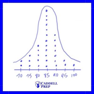
It has a bell shape, which we call a bell curve.

Dot plot and bell curve

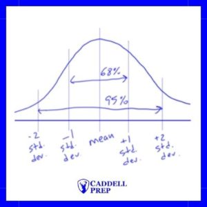
When data is normally distributed, we can use standard deviation to make estimates about the data. Two concepts that come up on the SAT are: about 68% of the values are estimated to be within one standard deviation of the mean and about 95% of the values are estimated to be within two standard deviations of the mean.

For example, if the mean chemistry final exam score for a school is 78 and the standard deviation is 6, we can estimate that 68% of the students scored between 72 (6 less than the mean) and 84 (6 greater than the mean. 95% of the values will be within two standard deviations (12) of the mean, so we can estimate that 95% of the students scored between 66 (12 less than the mean) and 90 (12 more than the mean).

Below is a diagram to help show the concept visually.

standard deviation percents

For example, below are the grades for two classes. Both classes have 23 students, a low score of 75, and a high score of 100. However, they have different standard deviations.

Class AClass B
Test ScoreFrequencyTest ScoreFrequency
751755
803804
855852
908905
954953
10021004


Most of the scores in Class A are between 85 and 95. But the scores in Class B are spread throughout the range. As a result, the standard deviation of Class A’s scores is smaller than the standard deviation of Class B’s scores.

7. Average Rate of Change

To find the average increase or decrease of a value over time, we just have to focus on the initial and final values.

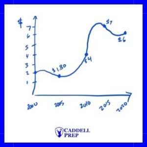
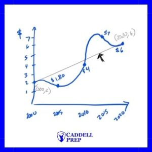
Let’s look at this graph that shows the price of an item over time.

The price changed at different rates at different times. In fact, at times the price was increasing and at other times it was decreasing.

We can find the average increase or decrease by finding the slope of the line drawn from start to finish.

example of price change over time

Rate of change = slope

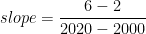
slope=\dfrac{y_2-y_1}{x_2-x_1},

slope=\dfrac{6-2}{2020-2000},

slope=0.2

The average increase is $0.20/year.

We can find the average change from a table also.

Example

Year

Average Home Price ($)

1970

180,000

1980

195,000

1990

220,000

2000

250,000

2010

205,000

2020

230,000

The table above shows the average home prices in Makebelieveville. What is the average annual increase in average home prices from 1980 to 2010?

Explanation & Solution

In 1980, the average was $195,000.

In 2010, the average was $205,000.

Since we are looking for the average annual increase, we need to find the change in price per year.

Rate of change = slope

slope=\dfrac{y_2-y_1}{x_2-x_1},

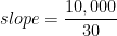
slope=\dfrac{205,000-195,000}{2010-1980},

slope=\dfrac{10,000}{30},

slope =333.33

Annual increase of $333.33

Tips

  1. Don’t pick “sample size” as the flaw in surveys—it’s almost always bias.
  2. For averages, calculate the sum first if that makes the problem easier.
  3. In probability, be crystal clear about the group you’re choosing from.
  4. Use slope to calculate average rate of change.

Example

The table shows the number of points scored by a basketball team in each of 10 games.

GamePoints scored
162
268
371
474
575
678
779
881
986
1096

The score from game 10 is removed from the data set. Which of the following best describes how removing this score affects the mean and the median?

A) The mean decreases, and the median decreases.
B) The mean decreases, and the median increases.
C) The mean decreases, and the median stays the same.
D) The mean stays the same, and the median decreases.

Video Explanation

Text Explanation

Answer: A

The score removed, 96, is greater than the other values, so removing it will decrease the mean.

Now compare the medians.

Original data set:

62, 68, 71, 74, 75, 78, 79, 81, 86, 96

There are 10 values, so the median is the average of the 5th and 6th values:

\dfrac{75+78}{2}=76.5

After removing 96:

62, 68, 71, 74, 75, 78, 79, 81, 86

There are 9 values, so the median is the 5th value:

75

The median decreases. The correct description is that the mean decreases and the median decreases.

Therefore, the correct answer is A.

Practice Problems with Video Explanations

Here is a set of practice Digital SAT data & probability practice problems. After selecting an answer, press “See Answer” to see the correct answer and a video explanation showing how to properly solve the questions. At the end of the set, after you press “Submit”, you’ll be able to see all of the questions, answers, and video explanations to review.

For more practice like this, enroll in our on-demand SAT prep course here: https://caddellprep.com/sat/prep/on-demand/

1.

The table shows the number of volunteer hours completed by a group of students during one month.

Number of volunteer hoursNumber of students
04
17
29
35
43

If one student from the group is selected at random, what is the probability that the student completed exactly 2 volunteer hours?

Question 1 of 3

2. A random sample of 320 homeowners in a county was surveyed about whether they support a proposed recycling program. Based on the survey results, it is estimated that 4,500 of the county’s 12,000 homeowners support the program.

Based on this estimate, how many of the 320 homeowners surveyed supported the program?

Question 2 of 3

3. At a high school, 40% of the students are juniors, and the remaining students are seniors. Of the juniors, 35% participate in the school’s peer tutoring program. Of the seniors, 25% participate in the program.

If a student who participates in the peer tutoring program is selected at random, what is the probability that the student is a junior?

Question 3 of 3


Common Mistakes

Three common mistakes students make when answering data & probability questions are using the grand total instead of a subtotal for probability questions, ignoring replacement vs no replacement, and not putting the numbers in order before calculating the median.

For Probability Questions, Using the Grand Total Instead of a Subtotal

A common mistake on probability questions is finding the probability based on a grand total instead of a subtotal. For example, a question might provide a table that shows the numbers of boys and girls for each grade in high school. The question might ask what the probability is of randomly selecting a female out of all of the juniors. The mistake could be to solve for the probability of female juniors out of all students, instead of out of just the juniors.

Ignoring Replacement vs Without Replacement

Another common mistake for probability is to ignore replacement vs without replacement when it comes to drawing multiple items.

For example, a question may ask for the probability of selecting two kings in a row from a deck of cards. If there is replacement, the probability of drawing a king the first time and the second time are both 4/52 because the king is returned to the deck of cards before the second attempt. Therefore the calculation will be

\dfrac{4}{52} \times \dfrac{4}{52} = \dfrac{1}{169} \approx 0.0059

However, if there is no replacement, then the probability for drawing the second king changes. Now, there will only be 3 kings left, and there will only be 51 cards to draw from.

\dfrac{4}{52} \times \dfrac{3}{51} = \dfrac{3}{663} \approx 0.0045

Not Putting the Values in Order Before Calculating the Median

A common mistake for data questions is not putting the values in order before calculating the median. The median is the middle number of the correctly ordered values, either from smallest to largest or from largest to smallest.

Frequently Asked Questions

Here are three frequently asked questions that I get from students when reviewing data & probability.

How do you solve arithmetic mean questions on the Digital SAT?

Most arithmetic mean (average) questions incorporate the concept that the sum of the items is equal to the number of items times the mean.

(Sum)=(Mean) \times (Number)

So, if a question starts by stating the mean of five numbers is 80, you will probably have to find the total of those five numbers by multiplying 80 and 5.

(Sum)=(Mean) \times (Number),

(Sum)=(80) \times (5),

(Sum)=400

How do you find the probability of two separate things happening?

To find the probability of two separate (independent) things happening, you multiply the probability of each one happening by each other.

For example, to find the probability of rolling a 3 on a die and selecting a queen from a deck of cards, first find the probability of each individually.

P(rolling a 3) = \dfrac{1}{6} because there is only one 3 out of 6 possible outcomes.

P(selecting a queen) =\dfrac{4}{52} because there are 4 queens in a deck of 52 cards.

So, the probability of having both outcomes happen is:

\dfrac{1}{6} \times \dfrac{4}{52} = \dfrac{1}{78}

Do I have to study complicated permutations and how to calculate combinations?

No, you do not have to study complex permutations and how to calculate combinations. They do not appear on the Digital SAT.

Related Topics

Percent and ratios & proportions are related to data & probability.

Percent

Data and probability questions tend to have percent concepts appear in them. Probability is often presented as a percent; likewise, pie graphs can display information as percentages. Therefore, it is important to understand percentages and to be able to solve percent questions.

Ratios & Proportions

Data and probability information is commonly presented as fractions, which are conceptually similar to ratios. Questions such as finding the ratio of voters to non-voters or red marbles to blue marbles incorporate data analysis and the use of ratios. Therefore, practicing ratio and proportion questions can help increase the number of data & probability questions a student answers correctly.

All Math Topics

All of our Math topics are available here: https://caddellprep.com/sat/math/ for you to review and improve on your SAT. There are lessons, practice problems, and video explanations for you. If you need more help, try our on-demand SAT course with video lessons, practice tests, and sets of questions for each topic: https://caddellprep.com/sat/prep/on-demand/

Glyn Caddell

Glyn Caddell holds a BS in Mechanical Engineering from NJIT and has been tutoring New York City students since 2008. He founded Caddell Prep in 2012 and is the author of Digital SAT Math Secrets: Lessons & Tricks to Quickly Improve to a Perfect 800 on the Math Test, which contains over 900 practice problems and is used in Caddell Prep’s SAT math classes. He is founding president of the Staten Island Technical High School alumni association and teaches every lesson on this site personally.