In this video, we will be using graphs to relate two quantities. Graphs are used here to measure the rate of change over a certain period of time. After you finish this lesson, view all of our Algebra 1 lessons and practice problems.
One example mentioned in the video is water in a bathtub. The graph’s starting point is always at x=0, and the y value on the graph represents the initial value. If the rate at which water is being added or drained from the tub is constant, then that rate of change will be represented by a straight line on the graph.
Examples of Using Graphs to Relate Two Quantities
Example 1
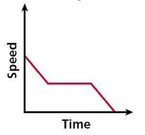
A car approaching traffic slows down, drives at a constant speed, and then slows down until coming to a complete stop.
Example 2
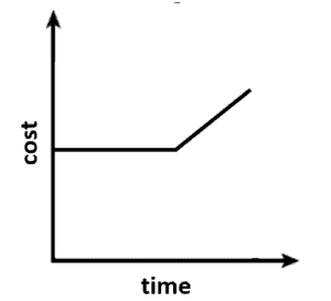
For the first part of the month of June, the cost of the cell phone remains constant. Then the cost increases steadily for the rest of the month as the number of minutes of calls increases.
Video-Lesson Transcript
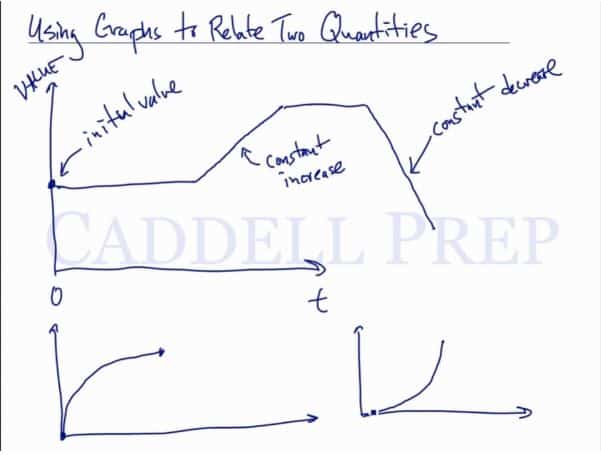
Let’s go over using graphs to relate two quantities.
Let’s have a graph with  and
and  axis.
axis.
axis represents time and axis is any other value.
To start with, any value in the axis is called initial value. Meanwhile, the starting point in axis is always  .
.
For example, represents your money in a bank account. The initial value is how much money you have in the bank at the beginning.
Another example would be water in a pool that’s being refilled or drained. This is the initial value of the water in the pool.
If we go to  , that means we have no initial value. But if we go up the axis, it shows the initial value greater than .
As time goes on, the line will show its changes.
If the line goes straight horizontally, that means the value remains the same.
If axis represents water in a pool, the level stays the same as time goes by.
But if we fill it up at a constant rate, it’s going to start to increase.
The line will go up in a straight slash line if its a constant increase.
The slope is the rate of change. So if it goes up in a straight slash line, it’s being filled at a constant rate.
If the line becomes straight horizontally again, it means that you stopped whatever you’re doing that’s changing it.
Now, if the line goes down on a straight backslash line, this is called a constant decrease.
So, what this means compared to a graph that has a curved line?
Yes, this is an increase since the line is still going up. However, it’s a curved line and not straight. A curved line means it’s not a constant increase.
Because again a constant increase will show you a straight slash line.
Let’s have an example:
 m from home
Runs farther from home for  mins.
mins.
Stops and talks for  min.
min.
Walks home
Let’s graph this using and axis.
axis represents time in minutes and axis represents the distance from home.
Let’s start at  and
and  .
.
is the distance from home.
Graphing the phrase “Runs farther from home” will show a straight slash line until he “Stops”.
So we’ll stop at  at the phrase “for mins.”. Whatever the value is at axis, we just have to stop there.
Then he “Stops and talks”, meaning he remained at his position.
His distance did not change. So this will show a straight horizontal line until  because of the phrase “for min.”.
The steepness of the line where he “runs farther from home” is the rate or speed of his run.
Now, since he “walks home”, his rate will not be the same. Because “running” is different from “walking”.
Now, our line will be straight backslash “going home” or until .
The steepness of the backslash is not as much as the slash.