Lesson: Average Increase/Decrease
After you watch the lesson above, try this practice problem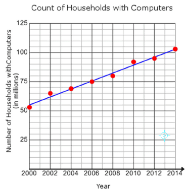
The scatterplot above shows counts of households in the U.S. with computers from 2000 - 2014. Based on the line of best fit to the data shown, which of the following values is closest to the average yearly increase in the number of millions of households with computers?