Give us a call (917) 722-0677

You can excel with Caddell!

1.
Based on the table shown above, what was the average yearly increase in Mary’s height?
2.
Based on the table shown above, what was the average monthly increase in population size?
3.
Based on the table above, what was the average weekly weight loss?
4.
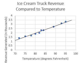
The scatterplot above shows the amount of money that an ice cream truck made on various days with different temperatures. Based on the line of best fit to the data shown, which of the following is closest to the average increase in revenue collected per degree Fahrenheit?
5.
The scatterplot above shows the test scores of several students compared to the amount of time they spent studying. Based on the line pf best fit to the data shown, which of the following is closest to the average test score increase per hour of study?


Note: Do not move on until the activity above has been completed and submitted.