In this lesson, you will learn about scatter plots and trend lines. Scatterplots are graphs of points that do not follow a specific trend. After you finish this lesson, view all of our Algebra 1 lessons and practice problems.
A line of best fit is an approximation of the direction in which the plotted points appear to be heading.
(ex. increasing, decreasing, remaining the same)
After you finish this lesson, view all of our Pre-Algebra lessons and practice problems.
Examples of Scatter Plots And Trend Lines
Example 1
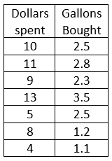
Construct a scatter plot from the given data.
It appears to be a positive correlation since the values increases together or it appears as positive slope.
Example 2
Construct a scatter plot from the given data.
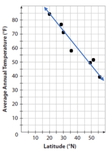
It appears to be a negative correlation since one value decreases as the other increases or it appears as negative slope.
Video-Lesson Transcript
In this lesson, you will learn what are scatter plots and trend lines.
We get scatterplots from data.
Please refer to the table at the left.
We have  and
and  coordinates ready.
Now, let’s plot the points.
Let’s start off with ") . Then
. Then ") ,
, ") ,
, ") ,
, ") ,
, ") and
and ") .
.
So if we graph this, this will not be a straight line. There is really no trend here to predict what comes next. As you can see, it changes every time.
The trendline will help us to better analyze these scatterplots. There is a relationship between the scatter plots and trend lines.
We can see that it’s still going up. We can expect that the next value will be higher or on the same level.
Also, the trendline is just a line sketch. To try and assume the different values.
The trendline will look like this. Going up.
There are points above and beneath the trendline. But its ok since this is just a line sketch of the scatterplots.
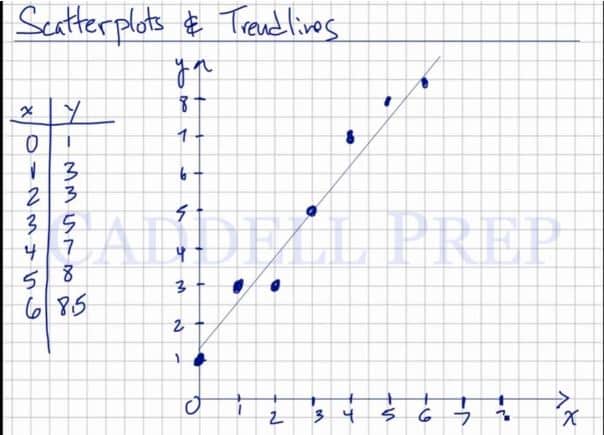
Using this trendline, we can make some assumptions.
We can say that when is  , probably is on
  .
.
We can further assume that when is  , is somewhere up, following the trendline.
Now, this helps us give future assumptions and gives us an idea of how relates to .
We can do this using a calculator. But for me, we can solve it by just eyeballing it. And to get the trendline and give us an idea of how to relate to the data given.